What Is HUE?
HUE is an app that narrated an artist’s history based on the gallery the user attends, thanks to Bluetooth devices found on the ceiling of the gallery the app will be able to track where a user is, and based on their location, the app will give the user the artist’s history narration based on the period and/or work of art. To create a truly informative and interactive experience for the user. The goal with HUE is to make art more accessible to the world and unite people through art. Everyone is an art fan they just don’t know it yet.
How It Works
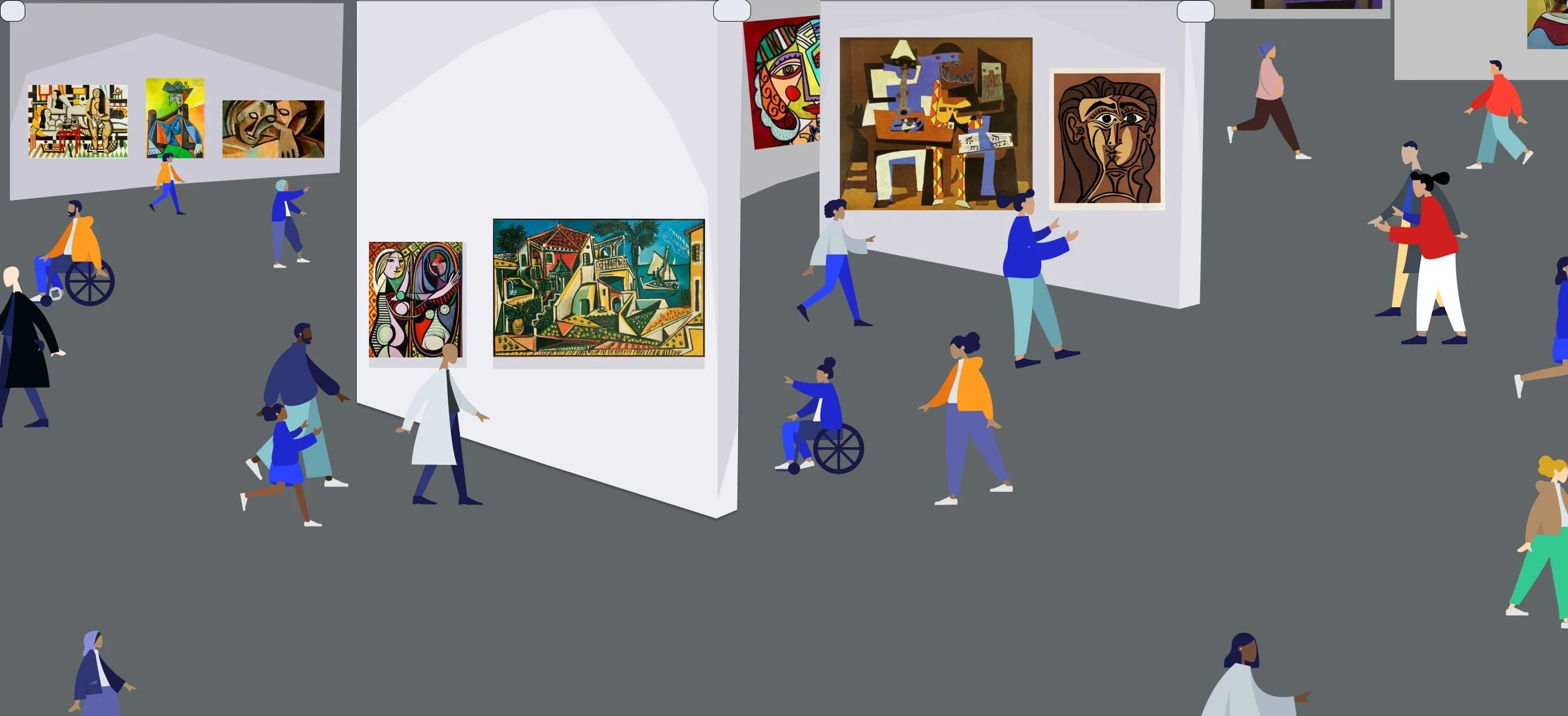
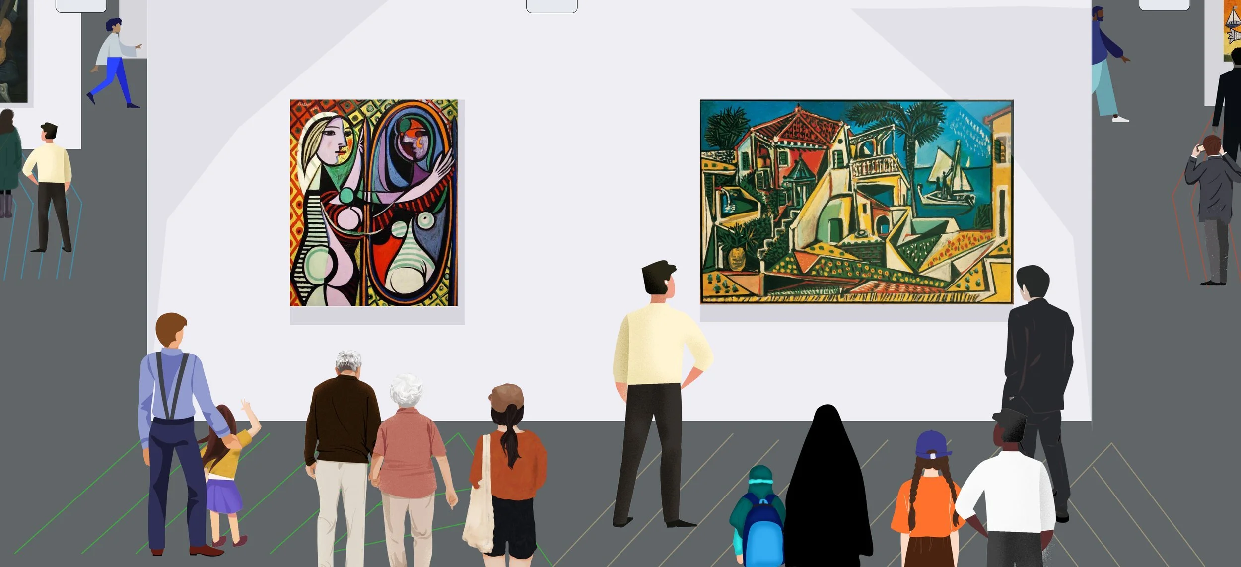
The primary function of the app is to give users an art history narration based on where they are in the gallery as shown by the green, yellow, blue, and red lines. My goal was to make the app as inclusive as possible so I offer users the app displayed in any language of their choice, as well as the app’s narrations in other languages as well. I wanted the feeling of the narrations similar to Podcasts or the stories on WNYC well-narrated stories that are engaging for the user.
If the user is standing in Picasso’s blue period, that is what is going to be played for them. If the user walks by specific artwork the user will get a backstory on that period of the artist’s life and about the art piece in general. The goal was fun well narrated interactive experience for all users to enjoy. Predominantly most users will download the app before entering the exhibition as shown below in the graphic of users scanning the QR code and downloading the app.
The secondary function of the app is making art more accessible to users, allowing smaller galleries to find as large galleries have. HUE gives equal opportunity for exposure to new, young, and old artists as well as venues. I wanted users to find new artists and galleries in their local area and share and discover art together.
Project Scope
Sketching, Wireframing, UI Design, UX Design, Prototyping, and Usability Testing.
Desired Solution
HUE is an app that gives user a unique curated art gallery biography experience.
My Role
Solo project for Google UX Design Course.
Problem
Create an art gallery bio app.
My Influences
Meditation
Meditation gives you empathy, which has changed my life. I have a much deeper understanding of people as well as my experiences with others is much greater due to having this empathy. I believe all people are art fans, Imagine bringing this concept of an unbiased position to the world of art how many people it would inspire and how much more people would appreciate others’ works from this empathy, I would love to bring something like that to HUE.
WNYC App
I went to go get lunch one day listening to WNYC on the radio I received my lunch and wanted to go inside my home. I downloaded the WNYC app and without any hassle or missing a beat the radio and the app on my phone were synced perfectly. That made me want to make HUE easy and seamless to start a hassle app. Most users will be downloading this at the venue so the goal is to make it as simple and easy to use as possible.
The Future
When I think about future tech I’ve seen in my lifetime the things that come to mind are Siri and the iPhone. On a deeper look, those are both interactive tech. The future to me is interactive tech, the concept in HUE that is future thinking is the fact that the app will automatically change the narration based on your location in the gallery which is futuristic to me.
McDonald’s
Everyone knows what McDonald’s is There is a McDonald’s in every country in the world. McDonald’s is such an American concept and yet people of all backgrounds and cultures consume and it’s simple. I wanted to bring that simplicity and something iconic to the app HUE I want it to be simple and useable for everyone.
My Mother
My mother is a 54-year-old Afghan woman whose English is not that sharp an app that narrates art at a gallery for her in the language of Farsi would be perfect for her. That’s when it hit me to make this app inclusive of all people from all walks of life. Make the app simple so my mother wouldn’t have to ask me to set it up and she could have the same experience that I could have as well.
Competitive Analysis
When it comes to the concept of having an art history bio pre-recorded for users it’s nothing new. This idea and technology has existed for quite a while. In my research of going to venues I’ve found that every venues has a version of a pre-recorded explanation of the artist and the tour of the exhibition. What I’ve noticed is users have to download several apps, or pay a fee and the signing up takes a long time. Which takes away from the experience. What I purpose is everything mentioned above, an exhibition tour guide, and artist history.
But HUE is free to the user, only requiring a email address, having the ability to purchase tickets in advance for the venue on the app and all of this on one convenient application on the users smart phone. The idea is that HUE will have all types of venues on the app, big and small so users are able to find new art and artists in their area. The venues will pay a monthly fee to be on the app. It will lead to more exposure for new up and coming artists, smaller venues. The biggest difference for HUE is that HUE is an interactive app where users set up the tour and forget it.
Listening to the tour guide users are able to make their own routes through the exhibition. The bluetooth devices on the ceiling will automatically skip to the next track based on the users movements and location in the exhibition. As well as being properly narrated and inclusive to all languages similar to an audiobook.
Early Versions
This was the first attempt at making HUE, it was not bad, but as I mentioned earlier CNN was an influence of mine but this feels like a bad rip off also too many icons as well as the color pallet feels strange. This is a good idea for HUE so far but this doesn’t feel like the app I have in my mind. In my mind HUE is more playful and fun to look at. I am so not 100% about having this many tabs I envision this more as an Event App that is only used to find HUE compatible galleries As well as individuals looking at bios of artists that they enjoy the experience from.
I think making an entire profile/account seems like such a long and discouraging process when it comes
to making an app like this. I’m thinking of just making a google sign-in something much quicker. So the user
can save their favorite aspects and revisit them.
The original idea w/ this was to make an interactive interface that is when a user is in a specific period the app changed to mimic the artist’s period and so would the layout of the app. I decided to take this out because it felt too much in the wrong direction as well as went against some of the ideas the HUE should have. HUEs focus is inclusivity, Narration, and a simple and pleasant interface/user experience. The plan was for users to not look at their phones, this felt a bit distracting for users.
As you will see later the idea of HUE expands over time.
Finding the right color was a challenge as well. I wasn’t sure what direction to take the app is colorful and bright, or more of a sleek solid look for the app.
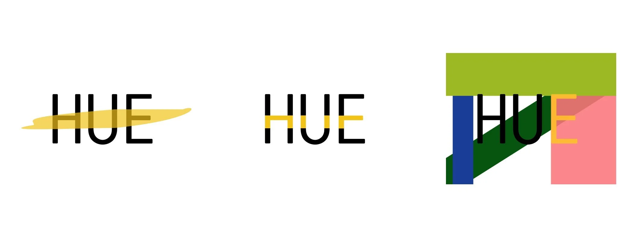
These are early concepts of the HUE logo. I wanted something that involved the three letters as well as adding color. Yet these ideas didn’t feel authentic to the brand itself, they didn’t feel right. I felt as though these ideas were over complicating a simple and direct to user idea.
Wireframes
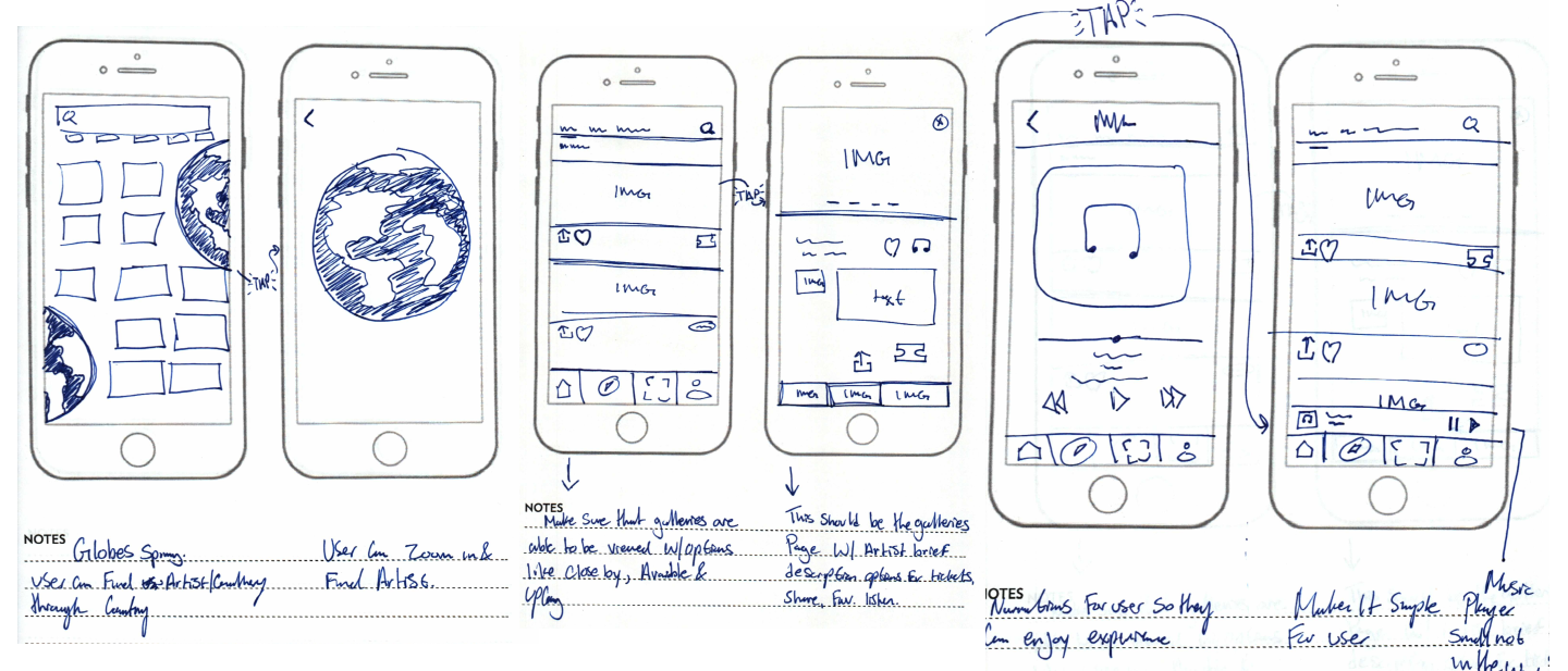
I originally made 5 hand-drawn wireframes each wireframe drastically different from the next. Yet each wireframe had an aspect that made it to the final version.
Home Page
Logo
My goal was to come up with a unique and simple design for the logo, Something that is timeless. Users will be greeted with this logo when they open the HUE app. I chose an embossed logo of HUE.
Home icon
My goal was to create a familiar home page similar to Nikes SNKRS but with art. Nike is the pinnacle of sportswear as well as extremely iconic and I love the layout of SNKRS I wanted to bring a similar flavor to HUE. My choice for this off-white color was to represent the look of an artist’s canvass. My goal was to make the app minimal as well.
Users can buy tickets for the gallery on the app so the wait time for the gallery goes down as well. I wanted to optimize use for users as well as a simple and efficient experience from the user. I wanted something confident yet humble, the homepage introduces the users to the closest art galleries to them they are also offered galleries that have not yet been released. My goal was a simple app that is fun, sleek, and playful. Besides Narrations on the app, I wanted users to find new artists, as well as learn things they may have not known prior to using the app.
Explore
Explore
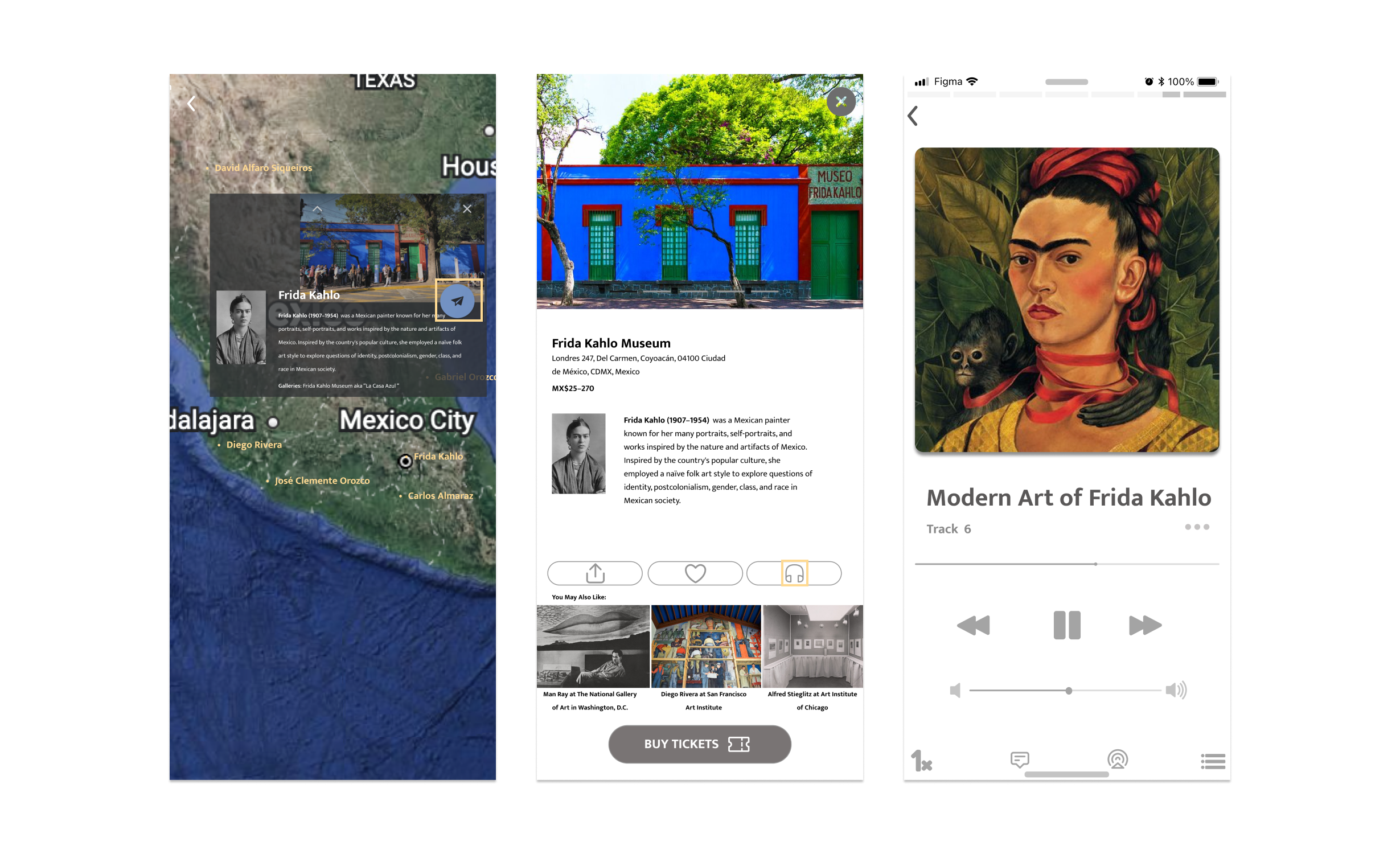
Users can see new art and galleries through the explore page, my goal was to introduce new concepts and small local galleries for the user so they can explore their area and find local artists as well. I added two spinning globes that the user can click on and spin the planet around like Google Earth and find out about artists and galleries in certain areas of the world or if they are planning a trip in the near future they can see what’s available. My goal was to unite people and make art to everyone make it simple for people to find artists and galleries. As you can see the user is looking at Mexican artists and finds Frida Kahlo.
The users find Frida Kahlo they read a brief description on them as well. The user has been redirected to the Frida Kahlo Museum and our user is now at the museum listening to the modern art of Frida Kahlo. During this experience, the user is able to speed up the playback speed or get a transcript of the audio, or they can skip to the next track. The goal was to give the user the ability to do what they want as well as give them all the options they would need.
QR Code
QR Code
The QR Code is here for the user to scan which will bring them to the galleries page on the app so they can listen to the narrations as soon as possible.
Profile Icons
Favorites
On the user’s profile, you get the option to have the purchased tickets scannable on the app, as well as options to check their favorite artists or galleries or mediums which will bring them to their page.
Purchases
This part of the profile page is for the user to see a log of what purchases have been made on their account.
Conclusion
This was an amazing experience of mine. In all truth HUE was truly a labor of love, this is the first project from the ground up for me. I finished TennisPAL in a few days in early February 2022, I started HUE in Mid February 2022, and finished in the first week of March 2022. I started with the idea of an artist bio app for art galleries and was primarily focused on making a sleek and sharp-looking app. As I went along I thought about my mother and the concept of “The Next Billion Users” the term means making a product that is not just for a targeted audience but people in different parts of the world and that was the plan for HUE. I wanted this app to be used all over the world with many language narrations, after the HUE logo the next option would be the language for the user, I wanted it to feel like the future and when you go to an airport you see all the different languages and know that this is worldwide.
With this app, I did so many wireframes and made so many more mistakes I truly gave HUE everything I had I gave it as much as I thought it needed I wanted it to be futuristically simple and not bloated whatsoever. I loved doing this and I’ve learned so much more than I thought I would this was truly a labor of love.

